Project 1a: Charts and
Graphs
The
personal computer (PC) serves as an excellent representation of how fast
technology has, and is, evolving. The
following is a brief report of how quickly the PC has developed, driven largely
by significant advances in processor (CPU) research and manufacturing.
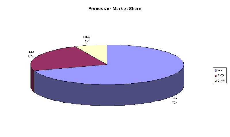
Processor
Market Share
The CPU is often described as the “brain” of the personal computer. This single chip is responsible for communicating with the multitude of components that comprise the PC. Intel Corporation has long been the industry leader in regard to personal computer chip research and manufacture. And even though the company has experienced serious competition lately from competitor Advanced Micro Devices (AMD), the following pie chart clearly illustrates that Intel still dominates the PC chip market (please note that the following numbers are estimates based on data from several sources):
Processor
Evolution
Intel
has continuously developed and marketed increasingly powerful processors for
the home PC, beginning with the “8080” which Intel first offered back in
1974. As can be seen in the following
bar chart, Intel has strived to maintain a steady product introduction cycle:
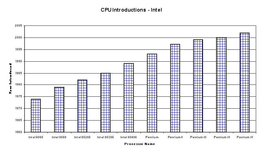
Processor
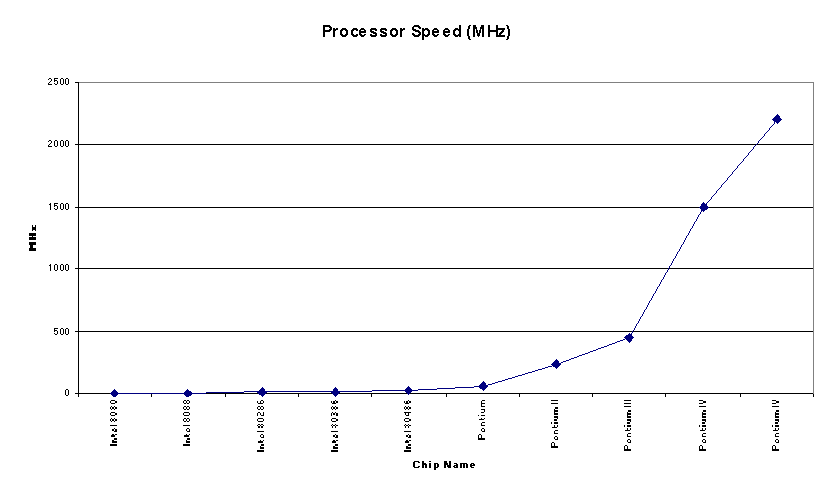
Speed
The
driving force behind processor research is speed. As long as Intel (or any chip maker) can market a faster CPU,
then there will exist sustained demand for the product. This next line chart depicts the humble
beginnings of the Intel processor, which started out at as the “8080” –
operating at a blistering 2 MHz.
Because of significant recent advances in technology, Intel has made
exceptionally large strides with the introduction of each of its new
processors.
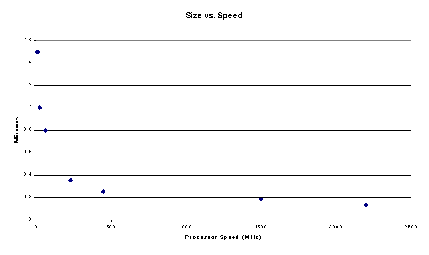
Smaller is Better
Computer
chip manufacturers spend significant resources trying to reduce the size of
their chip components. Processor speed
is directly related to the number of transistors that are contained on the
chip, the more transistors that the chip can employ to process instructions,
the faster the chip will operate overall.
Chip manufacturers often market the newest chips by advertising the size
of the wires used in the manufacture of the chip. The following scatter plot helps correlate size and speed (for
reference, the typical human hair is approximately 100 microns thick). Please note that the chart begins with the
80286 – this was done strictly for aesthetic purposes. The Intel 8080 and 8088 chips used
components that were significantly larger than those shown in the chart and
their inclusion made the chart impossible to read. There is not a lot of data here, but the trend is quite apparent:
![]()
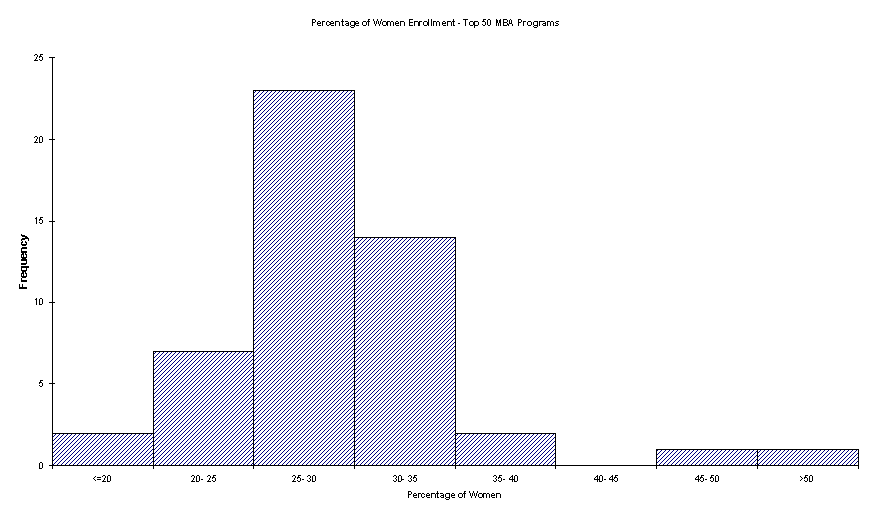
The
following is taken from Problem 3 in section 2.3 of the text. The StatPro Excel add-in that was packaged
with our text includes several data files.
Using the specified add-in and the data file P2_3.XLS, I have created
the following histogram that shows the female enrollment at the nation’s top 50
MBA schools (as rated by Business Week, 1997).
It can clearly be seen that women comprise roughly 25 – 35% of the
student body at the majority of the highly regarded schools.